Worldwide COVID-19 Analysis
COVID-19 Data Analysis
Introduction
This is an overview of a brief look that I had at the COVID-19 data as a way of showcasing some techniques I had learnt using python and qlikview.
Background
Towards the end of December 2019, Chinese public health authorities reported some cases of an acute respiratory disease in the Hubei province in Wuhan. They soon identified a novel coronavirus to be the main cause of these cases. The disease is now, worldwide, referred to as Coronavirus Disease 2019 (COVID-19), and the virus has been named as a severe acute respiratory syndrome coronavirus 2 (SARS-CoV-2). Which is a new strain of coronavirus not identified in humans before, making it very dangerous. Current research suggests this originated from Bats, in a food market, in Wuhan City. source: link
As of writing this (23/03/20) there was 345290 confirmed cases, 14925 deaths and 99541 recovered. source: link
Contents
The goal of this project was to visualise the data surrounding the SARS-CoV-2 virus, whilst showcasing qlikview as a visualisation platform. As github pages is a static site, I will be publishing graphs and data that will be out of date, the date of when the data ends will be made clear.
- Data
- Figures
- Summary
Data
I took 3 data files (csv) from here. This enabled me to track the location of the cases (by longitude and latitude) and also the number of deaths, cases and recovered patients. In order to get this data, I used python to fetch and clean the dataset and then save locally so accessing on qlikview would be quick and easy. The python script can run each day, updating when there has been a change to the source files. The code for the data cleaning can be found on my GitHub here.
Figures
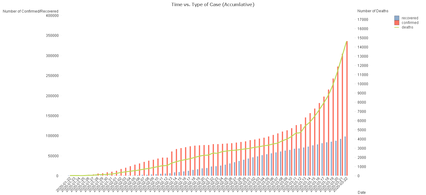
Figure 1 - Accumulative summary of cases
This figure shows, how over time, the different types of case have developed (Confirmed, Death and Recovered).

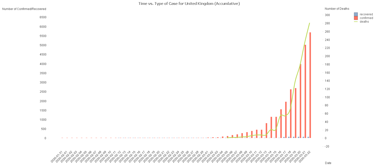
Figure 2 - Accumulative cases in the UK
This figure shows over time, the different cases for UK.

Figure 3 - Animated Bubble chart world map distribution of cases
The figure shows the spread of cumulative cases up to the date of this post.
Sorry, at the moment this link will only work on chrome, i’m looking into fixing this
Summary
Even though there is a clear uprising trend shown by the data, the questions which are important to ask are:
- The confirmed cases is purely based off how many people are tested and for most countries, even if people are suspected to have the virus they are told to stay home unless their symptoms are worsened. This results in the actual number of confirmed cases being much higher than what we have plotted in any of the graphs online.
- There is information such as age of the case individual, which would give a lot of important information to us. However, this has not yet been made publicly accessible, to my knowledge.